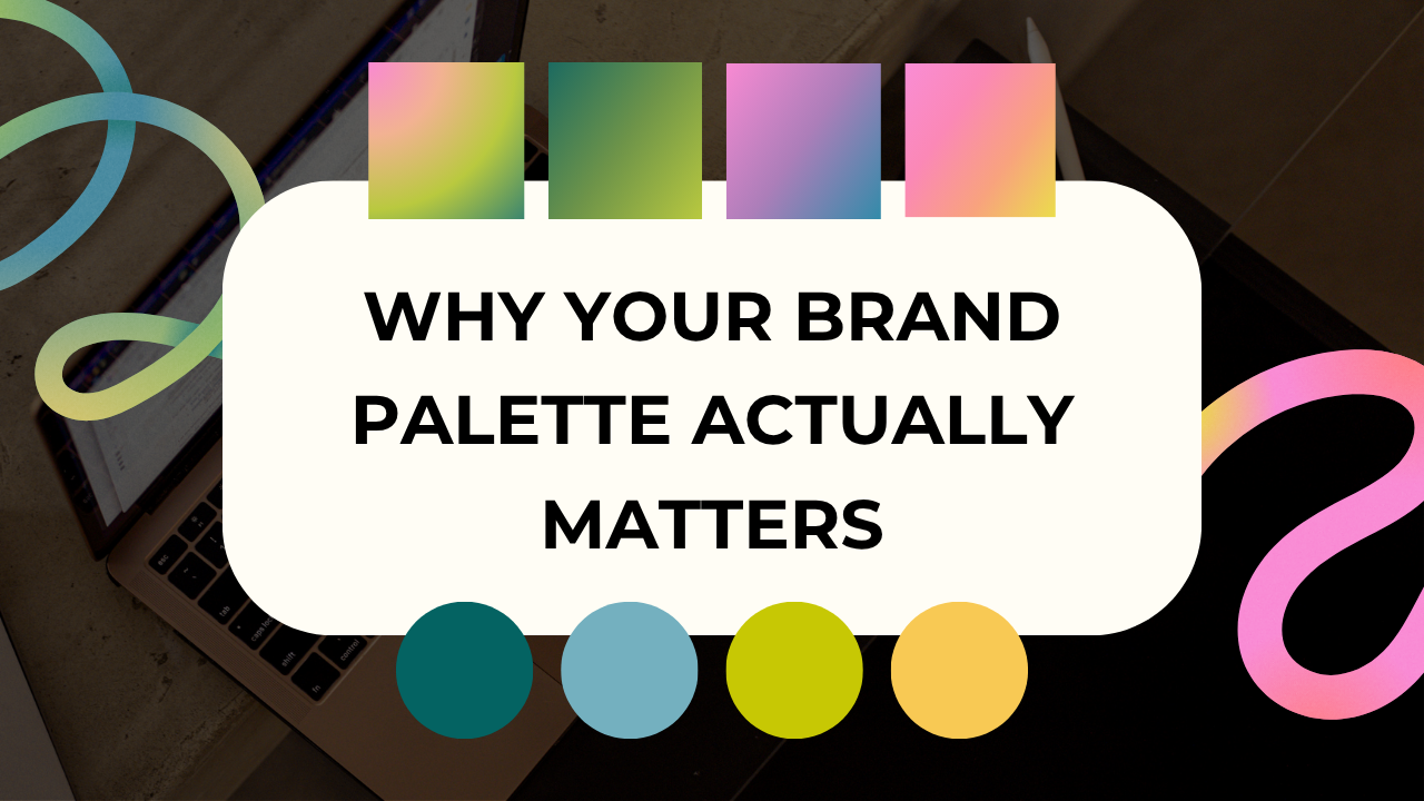
The Psychology of Email Colors: Why Your Brand Palette Actually Matters (And How to Use It Right)
You've spent hours crafting the perfect email copy. You've nailed your subject line. But did you know the colors in your email could be the difference between a click and a delete?
Color psychology isn't just marketing fluff—it's science. And when you're competing for attention in a crowded inbox, understanding how colors influence emotions and actions can give your small business a serious edge.
The Color Psychology Basics Every Business Owner Should Know
Different colors trigger different emotional responses, and these responses can directly impact how your customers interact with your emails.
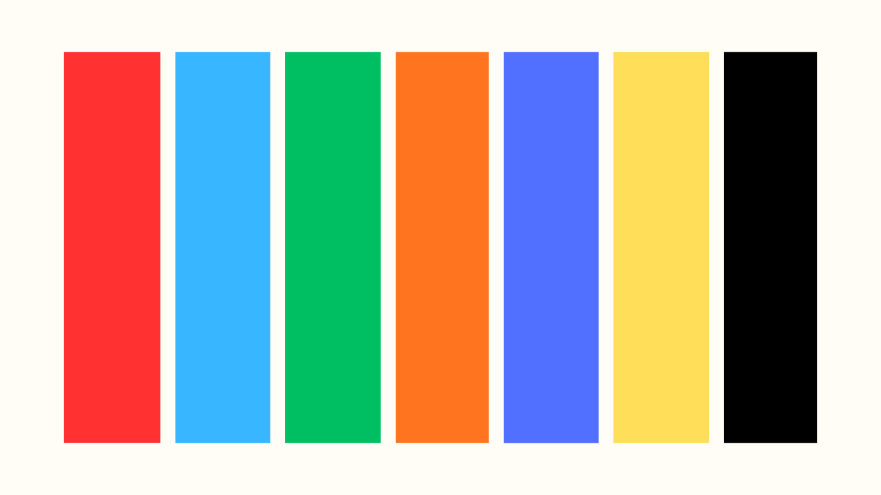
Red creates urgency and excitement. It's no accident that sale emails and "last chance" promotions often feature red buttons and banners. Red increases heart rate and grabs attention fast—perfect for limited-time offers or clearance sales.
Blue builds trust and reliability. It's why so many financial institutions and healthcare brands use it. If you're selling services that require customer confidence (consulting, coaching, financial products), blue reinforces your credibility.
Green signals growth, health, and go. It's ideal for wellness brands, eco-friendly products, or any "next step" action. Green CTAs often perform well because they feel positive and affirming.
Orange brings energy and friendliness. It's enthusiastic without being as aggressive as red. Orange works beautifully for creative businesses, food brands, and calls-to-action that need a warm, approachable vibe.
Purple conveys luxury and creativity. Use it when you want to position your products or services as premium or imaginative. Beauty brands and creative services often leverage purple successfully.
Yellow sparks optimism and warmth, but use it sparingly. Too much yellow can be overwhelming or hard to read. It works well as an accent color to highlight key information.
Black (and dark colors) communicate sophistication and elegance. Fashion brands, high-end products, and luxury services often use black to convey premium quality.
How to Actually Apply This to Your Emails
Understanding color psychology is one thing—using it strategically is another. Here's how to make it work for your business:
Match colors to your message. Sending a flash sale email? Red or orange will amplify that urgency. Introducing a new wellness product? Green reinforces the health benefits. Your color choices should support what you're saying, not contradict it.
Be consistent with your brand. While it's tempting to use red for every sale, consistency matters more. If your brand colors are navy and gold, you can still create urgency by adjusting your design layout, copy, and timing—without confusing your customers by suddenly going off-brand.
Test your CTAs. Your call-to-action button is the most important element in your email. Try different colors to see what resonates with your audience. Sometimes a contrasting color that pops against your design will outperform a "traditional" choice.
Consider color combinations. It's not just about individual colors—it's how they work together. High contrast improves readability (think black text on white background), while complementary colors create visual harmony.
Mind accessibility. About 8% of men and 0.5% of women have some form of color blindness. Ensure your emails don't rely solely on color to convey information. Use text, icons, and contrast to make your message clear to everyone.
The Busy Business Owner's Secret Weapon
Here's the reality: most small business owners don't have time to study color theory, A/B test endless variations, or design emails from scratch while running their business.
That's exactly why strategic email templates are a game-changer. When your templates are designed with color psychology already baked in—with CTAs that pop, brand-aligned palettes, and proven layouts—you skip the guesswork and get straight to results.
Instead of staring at a blank screen wondering which colors will convert, you're customizing professionally-designed templates that already use color strategically. You plug in your content, adjust to your brand, and send—all while knowing the design psychology is working in your favor.
The Bottom Line
Color psychology in emails isn't about manipulation—it's about communication. The right colors help your message land with more impact, guide your readers toward action, and reinforce your brand identity.
Start by being intentional about your color choices. Ask yourself: What do I want my customer to feel? What action do I want them to take? Then let color psychology support that goal.
And if designing emails that leverage all of this sounds overwhelming? That's what smart templates are for. Because your time is better spent running your business than becoming a color theorist.
Transform Your Email Marketing
Join Email Clubhouse to access resources and professionally designed email templates ready to customize and send.
